
About Medcloud
A Medcloud emerged in 2000 with the aim of helping doctors and empowering patients with a pioneering platform for sharing exams. Where patients, ordering physicians and radiologists manage reports and medical data flexibly and securely in the cloud.
In 2017, at a new time for the company, expanding its range of services, staff and structures, the need arose to reposition its visual identity. So the Vers agency stepped up to the challenge.
Logo creation
Starting from the core and purpose that the company was built on, we began a process of developing symbols that were directly linked. After much research, we arrived at our iconographic translation of the business.
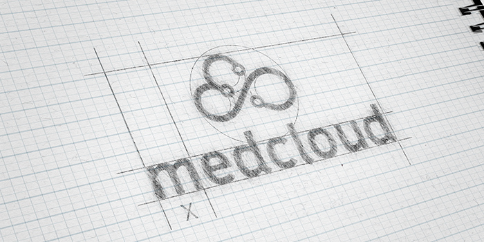
The Symbol
With clear symbols and the aim of creating a unique identity for the brand, we set about the manual creation process, putting the symbols together, adjusting and aligning them to achieve the ideal result.
After creating the symbol we had a new challenge: to come up with a typeface that demonstrates modernity, confidence and at the same time has a smooth digital demeanor.
Results
So we came up with a result that was part of a new moment for the company and created support for reaching new heights and new markets.
In addition to these materials, we generated the brand manual and initial materials and then moved on to the company's internal roll-out.
—————
"In mid-2018, Medcloud was repositioning its brand, and to do so, it sought a partner who was up to the challenge.
Vers was the chosen agency, beating the work submitted by other agencies on a scale of 5 to 1.
Vers' work was not only excellent and thought-provoking, but also led the way in presenting Medcloud's new phase to the market through its new visual identity.
Today we are very well served, with excellent results that can be compared to any global branding agency."
Dimas Francisco da Silva Junior - CEO at Medcloud